Culture At Large
Why Apple’s new headquarters isn’t designed for flourishing
I have the opposite of a NIMBY mindset, but it grieved me nonetheless to see the city of Cupertino, Calif., roll over, paws up, for the zoning approval of Apple’s new headquarters. I’m convinced this building will be bad for Apple and worse for Cupertino.
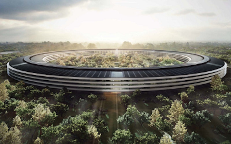
The giant bike tire of a building, designed by the office of Lord Norman Foster and expected to cost $5 billion, comes with sterling credentials: America’s greatest company, Britain’s greatest architect, carbon-neutral, yada, yada, yada. But what is this thing?
The media has already started referring to it as “Apple’s Spaceship.” Readers of a certain age may be reminded of the giant space station that appears in the second act of 2001: A Space Odyssey. I suspect the resemblance is more intentional than not. Foster (and Apple) would probably like this building much better if appeared to be floating free of the earth, like the concept design for the Guadalajara soccer stadium by Massaud and Pouzet. In its circular plan and its resistance to any acknowledgement of streets, sidewalks or indeed the city of Cupertino, Apple’s new command post exhibits all the worst abstracting tendencies of Modernism - great for iPhones, not so great for cities.
Why not so great? For reasons both philosophical and practical. Philosophically, like a walled medieval city, it denies the existence of anything outside of itself. Lacking any geometric relation to Cupertino’s grid of streets, Apple’s new home becomes inwardly focused, a Fortress of Solitude that denies its membership in Cupertino or any other community except the community of Apple. Some large churches have done the same thing (though not at this scale) with campuses that deny their connection to a community that includes non-members. It is difficult to imagine Apple ever hosting a public event at this citadel, even something as curated and safe as a charity cocktail party.
The design denies membership in Cupertino or any other community except the community of Apple.
On a more practical level, Apple’s headquarters, through its lack of urban integration, is exclusively car-centric, although token bike parking will be provided to ensure the building’s green cred. Perfectly round and set way back from streets, it’s as welcoming to pedestrians as an airport. It will have a gym, of course, to sort of compensate for the fact that no one who works there can walk there.
Another practical problem with Apple’s plan is one that real-estate professionals refer to as the “exit strategy.” If you can stretch your mind enough to envision a time when Apple is not among the most valuable companies on the NASDAQ exchange, how are they supposed to sell off this sealed container of a building to anyone else? It seems pretty clear that it can’t be done. Like the oversized shopping malls of another era, Apple’s headquarters is, or will be, a literal white elephant. Of course by the time Apple is bankrupt (Research in Motion, anyone?), that will become somebody else’s problem.
Contrast Apple’s mothership with a very different approach taken by online shoe retailer Zappos. CEO Tony Hsieh wants to redeem Las Vegas’ seedy downtown with new buildings that fit the urban grid, connect the company’s workers with walkable housing and shopping and provide space for restaurants and shops that can serve the public as well as employees. If your company has a billion dollars or so to drop on a new headquarters, I’d suggest that Zappos’ approach is far better for both the company and the community.
Topics: Culture At Large, Business & Economics, Workplace, Science & Technology, Environment, Arts & Leisure, Art